Monday, March 29, 2010

Psychedelic X Nouveau


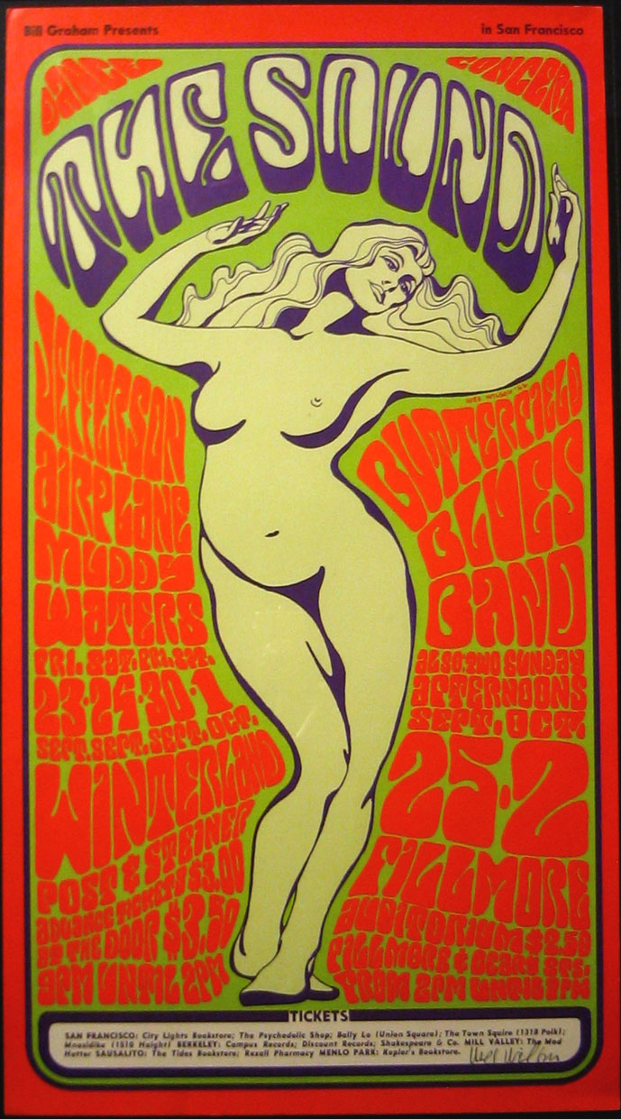
While surfing the web for Psychedelic posters, I came across this one. It immediately grabbed my attention because it reminded me of the homework question asking if Psychedelic should be renamed Art Nouveau Revival. This is because of the combination of visual motifs that are prevalent in this poster that it is ambiguous of both eras.

Typical of the Psychedelic style, the visual motif includes complementary colors and the use warped and bent lettering. What really captured my attention was the use of the feminine figure that was typical of the Art Nouveau period, influenced the Edo Art Period of Japan. The woman is made of many curvilinear lines that are also of the Art Nouveau period. Her coloring is also more pastel along with the title of the event which immediately pulls the eye to the center and most important part of the piece.

The use of this poster is what Psychedelic art was primarily used for: concerts. This can easily be seen by the name of the event along with dates, bands, and ticket information listed at the bottom.

Monday, March 15, 2010


After going to Furniture Lounge, I decided to look at furniture for my blog this week. I randomly came across this chair on rapper Kanye West's blog.

The Panton chair by Verner Pantoni is a simple curved shape that resembles many of the kidney curves we have seen in American Kitsch art. It reminds me of a futuristic Cesca Chairs that were mass produced during the Late Modern period with.

Monday, March 8, 2010

Red Russian Robot


I really really really love robots and took an immediate liking to this image as I was strolling across pictures of robots used in different motifs. Whenever I see robots, I usually see them used in a scientific form or in a vintage toy form. This is the first time I have ever seen one for political use.

This poster reminds me of a plakatstil or with the appearance of age on it, it just might be a plakatstil. The color red is used in different hues along with ray bans in the background. This is to create the emphasis of fear or importance along with the red star and symbolism of Russia which is Communist and is a depiction of Communism being the "Big Red Machine"

It reminds me of the political posters that we have studied during Pictorial Modernism Movement because of it being a poster and having a simple, geometric design laid out with a decent amount of detail with the use of some shadowing. It reminds me of the poster works of AM Cassandre.

Monday, March 1, 2010

Nike X Jeff


Nike Footwear is famous for its collaborations with other designers as well as design ideas for creating innovative footwear. This is especially true of the Nike Skateboard collection that produces rare, limited edition themes and then go on to produce numbers in the mere hundreds to be circulated world-wide. This would make the artists of the Arts and Crafts Movement very proud :)

This Nike design was inspired by the missing persons ads that used to be on the back of milk cartoons. The guy on the back of the shoe that is presented with Jeff is one of the graphic designers for Nike. Jeff was such as hardworker that no one would ever see in for days because he would just be creating. So in return, he was put on what engulfed most of his time.

This is personally my favorite sneaker of all time. It keeps the modern look of the Nike sneaker while integrating elements and colors of the past that were seen on traditional milk cartoons. It fully embodies its motif and conveys it accurately through the design.